Week 1
Photo booth- this was our first assignment in Digital
Foundations class! It was the first day I found myself confronted with reality.
Being enrolled in this class for the second time, I knew I couldn’t turn back.
I had to face my fears of taking a class that was all about Photoshop and
Illustrator. And it went all right... for the first day! We all took a portrait of ourselves and
simply converted it, with the rectangle tool, into our own creation. No layers
involved!

Horn Island- This
assignment was given during the Horn Island show downstairs on the first floor gallery. Still wanting to slowly
ease us into Illustrator, Mr. Strauzburger took us around the gallery, and told
us to choose a couple of the art pieces that we liked. Then we were to recreate them in Illustrator
confiding in our own personal interpretation as a guide, again using only the
rectangle tool and the fill tool.


 Bauhaus Days- This
project turned out better then I had anticipated. We have been talking in class
of the Bauhaus era in Germany, and its history powerful but simplistic use of line and form. So
guess what! Again with the rectangle tool, we were to find a image from this
period and recreate it. I started looking and found myself interested in a man by the name of John Austen. His woodcuts and ink drawing were so inspiring, that I
chose a self- portrait of his to replicate.
Bauhaus Days- This
project turned out better then I had anticipated. We have been talking in class
of the Bauhaus era in Germany, and its history powerful but simplistic use of line and form. So
guess what! Again with the rectangle tool, we were to find a image from this
period and recreate it. I started looking and found myself interested in a man by the name of John Austen. His woodcuts and ink drawing were so inspiring, that I
chose a self- portrait of his to replicate. Week 2
Week two, we worked on compiling two ideas or objects into
one creation. We were to create a hybrid piece of art that somehow joined two
nouns/things into a, hopefully, conceptual image. My handout words were, hair and airplane,
 Now I
remember distinctly talking to my sister the week that this project was due,
and I remember being repulsed by her suggestion that came to me over the phone,
“why don’t you create a hairy airplane?” My answer was clear, no.
Now I
remember distinctly talking to my sister the week that this project was due,
and I remember being repulsed by her suggestion that came to me over the phone,
“why don’t you create a hairy airplane?” My answer was clear, no.
So thinking of ideas, I came across images of
hair bands from the eighties. And after looking up a little bit of history of
the famous band, Motley Crew, my plans started to come together. These bands
lived incredible unstable lives that never really ended up as fairy tails do.
They were very centered around personal unjustifiable acts. So my image is
thus. Interpret it how it’s laid out please.
Week 3

 Hybrid Revised

Bauhaus - Again working with layers, we were to find a image from the Bauhaus era, and copy it with our own personal flair involved. I found this assignment fun, and recreated a German poster done by the name of Josef Muller Brockmann.
I must reiterate, learning how to use layers correctly was a salvation that came none too soon.


This next piece is not really influenced too much by the rules of Itten’s Contrasts, nor does it reflect real life space. Rather I wanted to work on colors and their transparencies, due to their overlapping each other. It was a study on value!


 Week 7
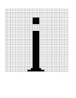
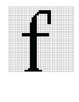
This week we had to create our own font, from a system that we, of our own creation, made up.
As simplistic and odd as these letters look, it was a bit of a struggle to manually count and color each pixel, and get the lines correct. We first had to draw them by hand and then draw them on Illustrator


Week 8
Our first assignment in Photoshop!! We learned how to scan a simple image and then duplicate it, using it as one would use a paint brush. It was an exercise in using a shape to make a shape.
Abstract

Representational

Week 9

Week 11 (skipping week 10)
We dove into the world of photo collaging!! Well I did anyways. The assignment was to create our own personal interpretation of heaven and hell in the world of photoshop, Then we were to place ourselves in each environment. I dislike with, strong intensity, when images are cut and pasted to look as one. So I did the opposite. I made a photo collages with only partial environment perceived. I made it very know, that my pictures were joined together. And I think it worked pretty well.
Heaven is home...
 Hell is being alone, alone, alone, and very confused.

 Week 12
This is our last week of making masterpieces, and boy is it time to retire for a bit!! Not to say that I didn't fully enjoy the experience, but I still struggle. Here is another interpretation of hell. This time I am looking at hell through a mirror. As if I am the only person who can understand completely my own pain. (And I was reusing homework).
Week 3
Gestalt Principles-
This project allowed for us to break up design principles down to their
basic roots… well not really, but we knocked on their door and looked into
their windows. And then promptly forgot we were there.
I created two very fine looking artistic examples that
represented closure, proximity and continuation!
Closure: A space that is no completely closed, but is
perceived at a glance as such.
Continuation: The eye
tends to follow through connected objects.
Proximity: Objects placed together, are perceived as a
single entity.


This opportunity to really show how I can develop an idea, failed to such an extent that I cannot look at what I made for this project without still shuddering. But for the sake of the doubt, lets say that I still did not really know how to use the layers tool in Illustrator at this time, and therefore did not even have the basic tools or knowledge to back me up. Keeping this project in that light helps me, and all you who look at this, survive another day. 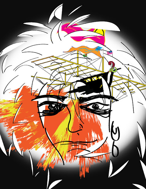
Week 4
Jan Tschichold project- This
project was great not only in the fact that we finally learned how to construct
layers but because of it, it allowed us to keep each piece in our projects safe
and separate from each other! This week we had to find a composition done by Jan
Tschichold and reconstruct it as best we could, down to the last curve of the
letter font. I, of course, misunderstood the project and did not worry too
heavily about finding the correct font. Rather I worked on getting the angles
and direction of the lettering correct. And to my benefit, for I don’t think
that it looks that bad, if standing a few feet away from the screen. Don't look too close now!

Bauhaus - Again working with layers, we were to find a image from the Bauhaus era, and copy it with our own personal flair involved. I found this assignment fun, and recreated a German poster done by the name of Josef Muller Brockmann.
I must reiterate, learning how to use layers correctly was a salvation that came none too soon.

Week 5
Itten Contrasts- This assignment was personally a bit difficult, as I wasn’t really sure how to go about it from the get go. I decided to try and portray the rule of simultaneous contrast and apply it to my first piece. As well, our first piece was to not only hold some kind of Itten Contrast, but it was also supposed to be a picture of some kind of environment. I took pictures of the front of the house where I live and used that as a guideline.
Simultaneous Contrast - Color visually vibrates next to it’s complimentary. Did I achieve this? I really don’t think I did for the colors that I chose were orange and green rather then orange and red.


Week 6
Tints and Shades- Taking this idea of Itten’s Contrasts, we
then reflected back to the basics of color. Using color in a digital manner is
entirely different then using colors in pigments. Using color from a digital
palette is subtractive in its science, making white the end result of primaries
mixed.
On the other hand, mixing primary colors from a paint tube
would result in a brown sea of expensiveness.
We each had to create two own color wheels. One that focused
on tinting colors, and one that focused on shading.


We also watched a video this class period that taught us how
Helvetica has been engrained in our society since the beginning of the
twentieth century. We didn’t have to “like” the video, but we did have to
create a piece that reflected Helveticas roles in society.

We were also supposed to create another environmental space,
that we commonly tread on a daily basis, and another portrait this week. I
managed the space project, and overlooked the portrait. Too much, too much!

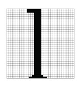
This week we had to create our own font, from a system that we, of our own creation, made up.
As simplistic and odd as these letters look, it was a bit of a struggle to manually count and color each pixel, and get the lines correct. We first had to draw them by hand and then draw them on Illustrator


Week 8
Our first assignment in Photoshop!! We learned how to scan a simple image and then duplicate it, using it as one would use a paint brush. It was an exercise in using a shape to make a shape.
Abstract

Representational

Week 9
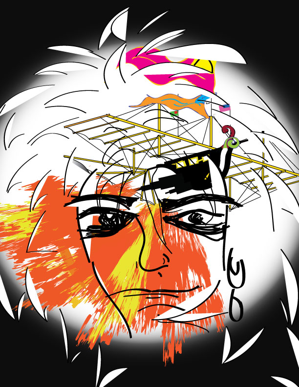
Another self portrait!!! Tracing and interpreting our self image. This was a lot of fun. I grew in a home of artists. I was never encouraged to trace an image... ever. This feeling of cheating will never leave, due to my upbringing, but it still was enjoyable to work on.
Week 11 (skipping week 10)
We dove into the world of photo collaging!! Well I did anyways. The assignment was to create our own personal interpretation of heaven and hell in the world of photoshop, Then we were to place ourselves in each environment. I dislike with, strong intensity, when images are cut and pasted to look as one. So I did the opposite. I made a photo collages with only partial environment perceived. I made it very know, that my pictures were joined together. And I think it worked pretty well.
Heaven is home...


This is our last week of making masterpieces, and boy is it time to retire for a bit!! Not to say that I didn't fully enjoy the experience, but I still struggle. Here is another interpretation of hell. This time I am looking at hell through a mirror. As if I am the only person who can understand completely my own pain. (And I was reusing homework).